Bibbidi-Bobbidi-Boo - Using a Custom Renderer to enchant your UI

While Xamarin.Forms provides a unified way to also create our UI from a single code base, the default controls tend to be just that; default controls. To be able to customize these, you can use a custom renderer. Don’t get me wrong, I am very happy with these controls and they can be used to create simple, no-fancy-design-needed apps. But when you have created some apps, you want a little bit more. You have to stand out between all the other apps already out there and how to do that better then with an awesome UI?
Luckily for us, Xamarin already foresaw this and gave us something that is called Custom Renderers (documentation). With custom renderers we’re able to render controls in our own way, rather than having Xamarin rendering it to the default control for that platform. With this we can customise how an image looks for example. And this is exactly what we will be doing, turn our UI into something magical like we are the fairy godmother herself!
If you’d like to see this work in a moving picture, check out my vlog episode on custom renderers.
The ugly pumpkin #
Right now my 4DotNet app has the default implementation of a ListView with Image Cells. This shows up in the app like this:
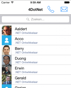
It looks ok! But why settle for ok if we can have AWESOME? For mobile apps, especially for profile pictures, it seems to be required that they are shown as circular images rather than the squares I have now. Let’s see if we can turn this around.
Bibbidi-Bobbidi-Boo! Custom Renderer I choose you! #
Now let us work some magic.
To work with our custom renderer, we first have to create our own image type. Let’s call this CircularImage. This type we can use in all our apps, so put it in the shared project of your solution.
namespace FourDotNet.Controls
{
   public class CircularImage : Image
   {
   }
}
Our CircularImage inherits from the default Xamarin.Forms.Image. If you like you could add some custom properties and other stuff in there, but for what we’ll be doing right now that won’t be necessary.
Now the rest consists of creating a custom renderer per platform. These I will name the CircularImageRenderer and these will inherit from the default Xamarin.Forms ImageRenderer, which will be the platform specific one (i.e. Xamarin.Forms.Platforms.iOS.ImageRenderer).
public class CircularImageRenderer : ImageRenderer
{
   // TODO
}
Bibbidi-Bobbidi-iOS! #
Let’s start with iOS.
We create our new file according to the above empty class and declare our iOS CircularImageRenderer.
private void DrawCircle()
{
    double min = Math.Min(Element.Width, Element.Height);
    Control.Layer.CornerRadius = (float)(min / 2.0);
    Control.Layer.MasksToBounds = false;
    Control.Layer.BorderColor = Color.White.ToCGColor();
    Control.Layer.BorderWidth = 3;
    Control.ClipsToBounds = true;
}
We start with defining a custom private method which transforms our square image to a round one and adds a border around it so it looks extra fancy.
In itself this does nothing, because we have to override our default renderer behaviour to make this transformation visible. So we override the OnElementChanged and OnElementPropertyChanged method like underneath.
protected override void OnElementChanged(ElementChangedEventArgs<Image> e)
{
   base.OnElementChanged(e);

   if (e.OldElement != null || Element == null)
      return;

   DrawCircle();
}

protected override void OnElementPropertyChanged(object sender, PropertyChangedEventArgs e)
{
   base.OnElementPropertyChanged(sender, e);

   if (e.PropertyName == VisualElement.HeightProperty.PropertyName || e.PropertyName == VisualElement.WidthProperty.PropertyName)
   {
      DrawCircle();
   }
}
With this code we respond to the event which is fired when the Element (Image in this case) has changed or any property of the Element has changed.
Within the ElementChanged we just check for nulls and then draw our CircularImage, with the PropertyChanged we check if the changed property has anything to do with the appearance of our Image. If so, we then redraw, if not, we do nothing.
That concludes the code we have to write for our renderer, that wasn’t so bad now, was it?
There is one vital line we have to add. We have to tell Xamarin that whenever it finds our custom control CircularImage, that there is a custom renderer for that. We do that in the same way as we saw in my previous post about Dependency Injection.
[assembly: ExportRenderer(typeof(CircularImage), typeof(CircularImageRenderer))]
namespace FourDotNet.iOS.CustomRenderers
{
    public class CircularImageRenderer : ImageRenderer
    {
       // ... The above code is here
    }
}
Note the first line here. We state that we export a renderer for our type CircularImage, and that renderer is of our type CircularImageRenderer.
Bibbidi-Bobbidi-Android! #
On to our Android renderer.
As you might expect this process will be roughly the same, only the implementation will be different. However, this is more true for Windows Phone than Android. On Android there is no physical layer to interact with, so instead we need to override the method that Xamarin uses to draw the child controls.
We can do this by using the below code;
protected override bool DrawChild(Canvas canvas, View child, long drawingTime)
{
   var radius = Math.Min(Width, Height)/2;
   var strokeWidth = 10;
   radius -= strokeWidth/2;

   //Create path to clip
   var path = new Path();
   path.AddCircle(Width/2, Height/2, radius, Path.Direction.Ccw);
   canvas.Save();
   canvas.ClipPath(path);

   var result = base.DrawChild(canvas, child, drawingTime);
   canvas.Restore();

   // Create path for circle border
   path = new Path();
   path.AddCircle(Width/2, Height/2, radius, Path.Direction.Ccw);
   var paint = new Paint();
   paint.AntiAlias = true;
   paint.StrokeWidth = 5;
   paint.SetStyle(Paint.Style.Stroke);
   paint.Color = Color.White;
   canvas.DrawPath(path, paint);

   //Properly dispose
   paint.Dispose();
   path.Dispose();

   return result;
}
Also, since API Level 18, hardware acceleration for drawing was introduced. As you might know, that is something you’d want to use!
You can set a flag to use software rendering for below API Level 18 in the OnElementChanged event like below.
protected override void OnElementChanged(ElementChangedEventArgs e)
{
   base.OnElementChanged(e);

   if (e.OldElement == null)
   {
      if ((int)Android.OS.Build.VERSION.SdkInt < 18)
         SetLayerType(LayerType.Software, null);
   }
}
Of course, don’t forget to export your renderer!
Bibbidi-Bobbidi-Windows Phone! #
The Windows Phone renderer is again a bit easier. We can just use the Clip property here and assign a EllipseGeometry to it, like so.
protected override void OnElementPropertyChanged(object sender, System.ComponentModel.PropertyChangedEventArgs e)
{
  base.OnElementPropertyChanged(sender, e);

  if (Control != null && Control.Clip == null)
  {
    var min = Math.Min(Element.Width, Element.Height) / 2.0f;

    if (min <= 0)
      return;

    Control.Clip = new EllipseGeometry
    {
      Center = new System.Windows.Point(min, min),
      RadiusX = min,
      RadiusY = min
    };
  }
}
And again, let’s not forget to register our custom renderer.
[assembly: ExportRenderer(typeof(ImageCircle), typeof(ImageCircleRenderer))]
namespace FourDotNet.iOS.CustomRenderers
{
   // ...
}
Turning it into majestic golden carriage #
For the last bit we have to use our new CircularImage and see how all this looks like.
Before I have used a ListView with an ImageCell, in XAML that looks like this.
<ListView IsPullToRefreshEnabled="True" Refreshing="EmployeeListView\_OnRefreshing" ItemTapped="EmployeeListView\_OnItemTapped" x:Name="EmployeeListView">
   <ListView.ItemTemplate>
      <DataTemplate>
         <ImageCell ImageSource="{Binding PhotoUrl}" Text="{Binding Name}" Detail="{Binding Function}">
            <ImageCell.ContextActions>
               <MenuItem Text="Stuur e-mail" Clicked="EmployeeContextEmail\_OnClicked"></MenuItem>
            </ImageCell.ContextActions>
         </ImageCell>
      </DataTemplate>
   </ListView.ItemTemplate>
</ListView>
Of course an ImageCell is a composite of a few controls already which acts as a template for a list item. although you can create your own custom cell, for now I will create my own list item template right here in the ListView. This probably isn’t what you would want in your final application, but for the sake of this example it will do.
In the underneath code you will see how I replaced the ImageCell with my own template and made it look similar.
<ContentPage xmlns="http://xamarin.com/schemas/2014/forms"
             xmlns:x="http://schemas.microsoft.com/winfx/2009/xaml"
             xmlns:controls="clr-namespace:FourDotNet.Controls;assembly=FourDotNet"
             x:Class="FourDotNet.Pages.EmployeesPage"
             Title="Medewerkers">
<!-- ... Some XAML omitted here ... -->
<ListView.ItemTemplate>
   <DataTemplate>
      <ViewCell>
         <ViewCell.ContextActions>
            <MenuItem Text="Stuur e-mail" Clicked="EmployeeContextEmail\_OnClicked" />
         </ViewCell.ContextActions>

         <StackLayout Orientation="Horizontal">
            <controls:CircularImage Source="{Binding PhotoUrl}" />

            <Grid>
               <Grid.RowDefinitions>
                  <RowDefinition Height="\*" />
                  <RowDefinition Height="\*" />
               </Grid.RowDefinitions>

               <Label YAlign="End" Grid.Row="0" Text="{Binding Name}" TranslationY="4" />
               <Label YAlign="Start" Grid.Row="1" Text="{Binding Function}" FontSize="Micro" TextColor="Accent" />
            </Grid>
         </StackLayout>
      </ViewCell>
   </ListView.ItemTemplate>
</ListView>
<!-- ... Some XAML omitted here ... -->
</ContentPage>
You will notice that you have to specify a new namespace which specifies where my custom CircularImage resides. In this case I have used ‘controls’. Now with this new namespace I can define my CircularImage control just like any other ’normal’ control.
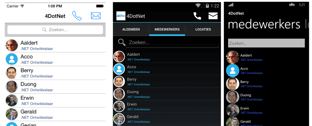
When we run this on all of the different platforms, you will see an enchanting result…!
To create these custom renderers I have followed another blog-post by James Montemagno and the documentation of Xamarin, so code similarities might be apparent. All credits for the math-hocus-pocus goes to him/them.