iOS UITableViewCellStyle in Xamarin.Forms

In the past week, a question came across on StackOverflow for which I created a sample project. The question was: how to make the detail text of a TextCell appear on the right?
I started to answer the question, as I do a lot, and quickly came across the UITableViewCellStyle in iOS. I thought it would be as simple as that, but I was wrong.. Now it had me intrigued, because I didn’t implement it myself before and it had no apparent solution. Once I got started on it, I needed to know exactly how things are tied together. And to do even better, I will now share it with you!
The Challenge #
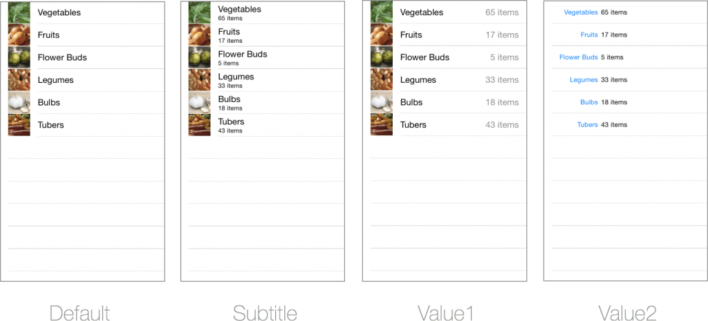
So, let’s first have a look at the problem challenge at hand. With Xamarin.Forms you get a lot of predefined Cells already, one of which is the TextCell. The TextCell provides you with a simple cell layout to show a primary text and a detail text under it. But for iOS, more variations are possible as we can see on the Xamarin documentation page.
- Default – supports a
UIImageView.- Subtitle – supports a
UIImageViewand subtitle.- Value1 – right aligned subtitle, supports a
UIImageView.- Value2 – title is right-aligned and subtitle is left-aligned (but no image).
This translated into these variations visually:
But how do we access this kind of functionality from within Xamarin.Forms?
As you might have guessed, you will need a custom renderer for this. So I created one for a TextCell, and though I could just set the UITableViewCellStyle property I found before and be done with it. Unfortunately, that was not the case. As it turns out, you can only determine the cell layout whenever you instantiate it. And then there is the concept of cell reuse that you take into account as well.
The Solution #
The final solution turned out to be a TextCell renderer, but instead of setting just one property, we need to override the GetCell method and provide the right UITableViewCellStyle directly when creating a new instance of our cell. The final implementation looks like this:
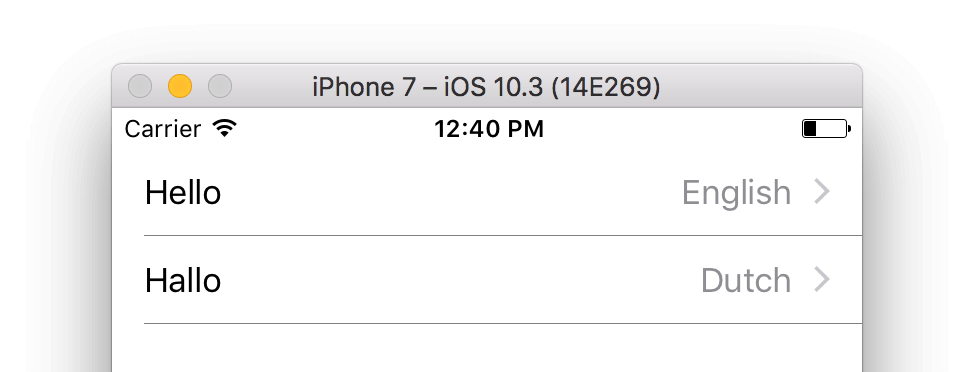
Since I only override the TextCell I can safely cast it like this. We then check if there is a cell that we can reuse, if not we create a new one. And that is where the magic happens! Here you see the UITableViewCellStyle.Value1 make it’s appearance. After that we need to set the right properties etc. and return our new cell. And that it that! We now have the effect we were after, you can see it below.

And if we were to set it to UITableViewCellStyle.Value2, it would look like this:

In the original question, it was also required to have the accessory icon at the right side. This can be combined. On line 19, you can set the Accessory property as well. Although, this one is not required to be set when instantiating. You can set it later as well. The result of this, and ultimately the answer to the StackOverflow question will then look like this:
All code for this can be found on a GitHub repository.