Adding TitleColor to Your Picker in Xamarin.Forms
If you have always wanted to give the title of your Picker control a color, this is your lucky day! A pull request is merged that will let you do just that. It introduces a new property on the Picker control that allows you to set the TitleColor. In this post, I will show you how to use it and what it does.
The Picker Control #
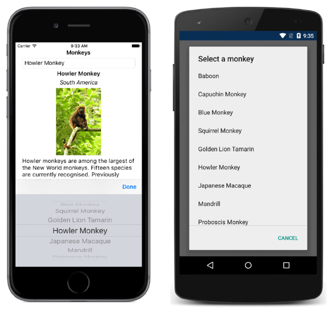
Before we get to the new feature, let’s have a closer look at the Picker control itself. Because actually there is no such thing as a Picker control. The Xamarin.Forms Picker control is actually a combination of an Entry control that triggers the native way of picking a value from a list. Depending on the actual platforms the concrete implementation varies a little bit.
You can see an example of what this looks like on iOS and Android in the image underneath.

The Xamarin.Forms Picker control on iOS and Android
Since the first implementation of the Picker it has a Title property. With that title you can let the end-user know what you expect them to pick there. Again, depending on the platform implementation this title will show as the placeholder in the entry or above the entry.
What was not implemented was the ability to style this title. That is why an issue was opened on the Xamarin.Forms repository, which requested to be able to add a color to the picker title.
Introducing the new TitleColor property #
If you have read earlier posts about contributions to Xamarin.Forms, you might know by now that implementing a new feature is usually a matter of building it in the abstract layer and then in the platform specific renderers.
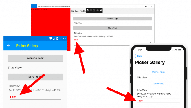
In the abstract layer, in this case, the Picker control, we add a new property that the developer can use to let us know what color to use. Now that we have this value, we can go into the renderers to take that color and render it in a way that would make sense on that platform. In the image underneath, you can see what that looks like on the different supported platforms which are iOS, Android and UWP right now.

Picker TitleColor in Action on iOS, Android and UWP
Android Dialog Title #
When I opened the PR, it got approved pretty fast. But also Paymicro “challenged” me and said that it would be awesome if the dialog on Android would have the same title color. When you open a picker on Android, a new dialog is shown with all the options the user can pick from. This dialog also has a title.
It took a bit of effort to get it right. The dialog is creating using a AlertDialog.Builder. This has the ability to simply set the title from a string or load an entire view. This lets you customize the whole title. The latter option would mean that I have to mimic the looks of the title by guessing how big the font size and position is etc. If at all possible, I didn’t want to do that.
Then, at some point I got the idea to make a spannable string, color that and load that through the regular method that just takes in a string for the title. And whatdayaknow! It worked :)
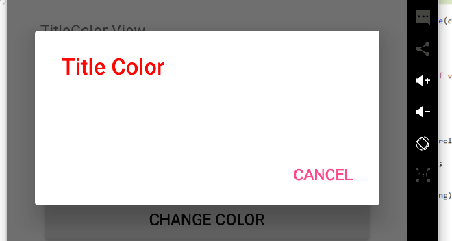
The end result is in the image underneath.

Android Picker dialog TitleColor
Summary #
Although the feature might be a small one, I still hope you find it useful. I don’t think it is clear yet in which Xamarin.Forms version this will be incorporated. Maybe, just maybe, it will be 3.5 and I’m guessing that it will be in 4.0 for sure. Keep your eyes on the release notes and it will pop up eventually.
Let me know if you are using this or anything else I implemented, or maybe you have a few ideas of your own. I’m always open to chat! Thank you for reading!