Reusable custom usercontrols with BindableProperty
While working on a project I had to develop multiple forms which involved multiple fields which required to input a (valid) date.
Xamarin already included a default DatePicker. But I need one which could be fit into my form being a TableView, also provided by Xamarin. Unfortunately for me, they didn’t combine these two to create a DatePickerCell. Luckily for you, I have done that for you!
In this post I will describe how to create your own reusable user control in the form of a DatePickerCell. But with a little imagination you can apply it to other controls as well!
What the Cell?! #
As described I started out with a TableView form, which looked like this:
Ok, it looked something like this. It had a little less awesome. But you get the picture.
After creating two of these DatePicker ViewCells I decided that this wasn’t the way to go. If I wanted to make a change to the layout or looks I had to go through all my pages and change it in every ViewCell that contains a DatePicker.
So, I decided to create my own kind of Cell, the DatePickerCell.
First I wondered for some minutes how I would go about it. Of course I could create a new class, inherit the ViewCell and define my layout in code. But I like to do my UI in XAML..! So then I went on and created a Controls folder in my PCL project first. Then with a right-click there and Add > New Item I scrolled through my options, but there was everything but something stating ‘control’.
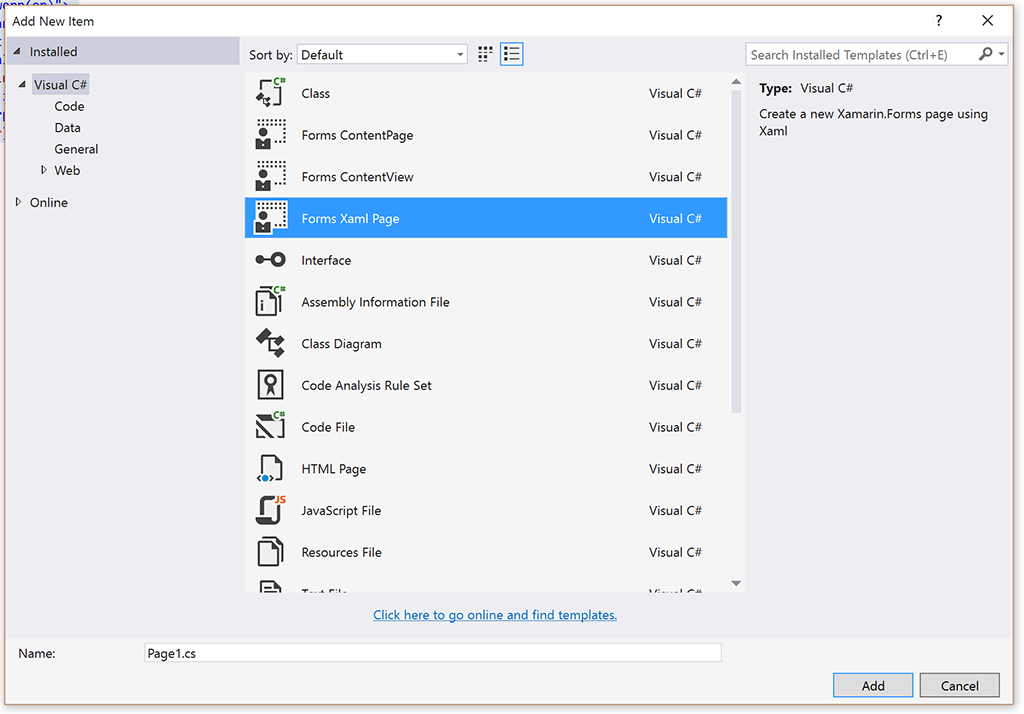
Eventually I decided to go with the ‘Forms Xaml Page’ option.
Now what I learned here was that you shouldn’t be thrown of track by the ‘Page’ part of this option. Although it will generate a ContentPage for you, you can turn it into any View that you like. So in my case a ViewCell, which seemed most appropriate. The XAML I put in is shown below.
So far for defining my DatePickerCell, now on to using it in my form. Notice how I replaced the ViewCell with my brand new one.
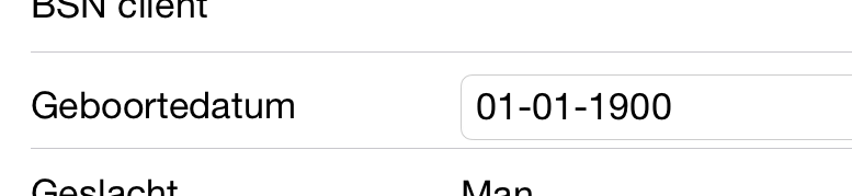
Let’s see how this looks in runtime.
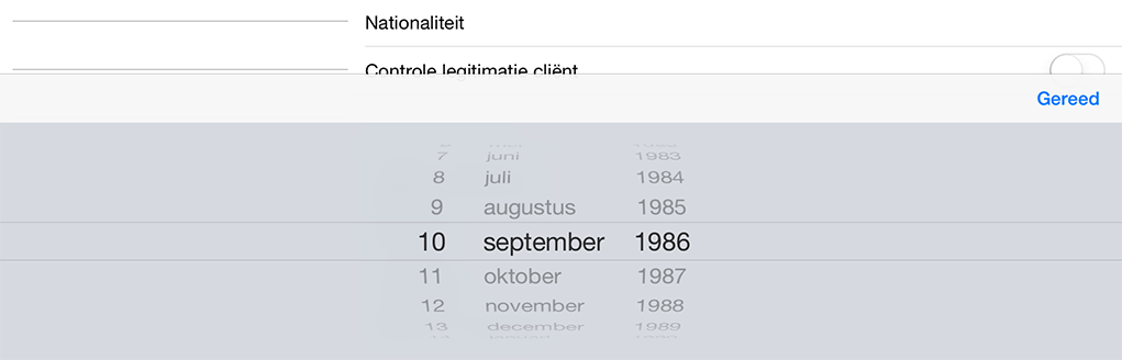
And when you select it, you get the date picker as you would expect it on iOS.
As a perfectionist I don’t really like the double border thing going on in this cell. So I have to make up for that by implementing some logic in a custom renderer. The renderer is pretty much as straight forward as it gets, you just tell it to remove the border at the OnElementChanged event.
\[assembly: ExportRenderer(typeof(DatePicker), typeof(DatePickerRenderer))\]namespace MyAwesomeApp.iOS.CustomRenderers
{
public class DatePickerRenderer : Xamarin.Forms.Platform.iOS.DatePickerRenderer
{
protected override void OnElementChanged(ElementChangedEventArgs
        Control.BorderStyle = UITextBorderStyle.None;
    }
}
}
Now, it looks much better;

So, now you know how to create this bindable custom control. Now that wasn’t so hard, was it?
Like I said at the beginning; it shouldn’t be too hard to come up with some other controls which you will use often. For example; right when I finished this one I’ve created a PickerCell for my enums!
Good luck! And if you have any questions or improvements, please don’t be shy and contact me!
For my next blogs I will try to put up as much code on GitHub so we can exchange ideas a little easier :)