Spicing up your Xamarin (Forms/iOS) TabBar
One of the most popular navigation patterns on all platforms is by making use of the TabBar. Xamarin.Forms already acknowledged this by incorporating the TabbedPage in their default control set. While the tabs are platform independent - besides from the look on the specific platform - I want to talk a little bit about the iOS part specifically.
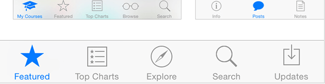
When I first started out with Xamarin and Forms I just put in the TabbedPage, specify some icons and be done with it. But looking at other iOS apps, mine always seemed to be odd. Soon I figured out why; on iOS a selected tab has a selected icon which is typically a filled icon. Let’s have a look.

This is how a TabBar icon and selected TabBar icon looks like in default Xamarin.Forms with iOS. If we compare this to the TabBar in the iOS App Store app we notice the difference immediately. It has filled icons! So how can we achieve this in our app?
Diving into this I quickly came across some Apple documentation which told me that it can be done out of the box on iOS with the selectionIndicatorImage property. So Xamarin Forms probably lacks the possibility due to the fact that only the most multi-platform features are implemented. But no worries! This is where Custom Renderers come in very handy!
So lets jump right in, go over to the iOS project, create a custom renderer - you remember how, right? - and put this into it.
using System; using iOSTabBarSample.iOS; using Xamarin.Forms; using Xamarin.Forms.Platform.iOS; using UIKit;
\[assembly: ExportRenderer (typeof (TabbedPage), typeof (TabBarRenderer))\]namespace iOSTabBarSample.iOS { public class TabBarRenderer : TabbedRenderer { private bool _initialized;
    public override void ViewWillAppear (bool animated)
    {
        if (!\_initialized) {
            if (TabBar?.Items == null)
                return;

            var tabs = Element as TabbedPage;

            if (tabs != null) {
                for (int i = 0; i < TabBar.Items.Length; i++) {
                    UpdateItem (TabBar.Items \[i\], tabs.Children \[i\].Icon, tabs.Children \[i\].StyleId);
                }
            }

            \_initialized = true;
        }

        base.ViewWillAppear (animated);
    }

    private void UpdateItem (UITabBarItem item, string icon, string badgeValue)
    {
        if (item == null)
            return;

        try {
            if (icon.EndsWith (".png"))
                icon = icon.Replace (".png", "\_selected.png");
            else
                icon += "\_selected";

            item.SelectedImage = UIImage.FromBundle (icon);
            item.SelectedImage.AccessibilityIdentifier = icon;
        } catch (Exception ex) {
            Console.WriteLine ("Unable to set selected icon: " + ex);
        }
    }
}
}
So what happens here?
In the ViewWillAppear method we determine if there are any tab items to process. I’ve also included a boolean to make sure it only runs the first time the page is shown. If the SelectedImage is set, we don’t need to touch it again.
Then we are going to take those tab items and run them through the UpdateItem method we have created. Inside that method you see that first thing is to check how our icons are named. In Xamarin.Forms you can skip the extension and the images are correctly found on each platform. If you did add the extension for some reason, let’s just get that checked.
But either way, we append ‘_selected’ to it and set the SelectedImage property to that icon. And that’s it! Of course, if you want another naming convention, feel free. Also, if you want to be completely free to give in a different name altogether, you might want to look at inheriting the Page and add a SelectedIcon property to it or something. Be creative!
If we run the app now, we directly see the effects.
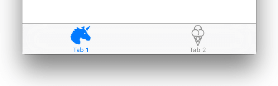
Wow! Awesome! That’s what I’m talking about!
Now while we are at it, you can give it your own color as well. This can be done with something called the TintColor. This is useable on multiple types of controls, but is also used for coloring the icons and text in the TabBar.
To do this just add this one line in your AppDelegate.
\[Register ("AppDelegate")\]
public partial class AppDelegate : global::Xamarin.Forms.Platform.iOS.FormsApplicationDelegate
{
    public override bool FinishedLaunching (UIApplication app, NSDictionary options)
    {
        global::Xamarin.Forms.Forms.Init ();

        UITabBar.Appearance.TintColor = Color.Red.ToUIColor ();

        LoadApplication (new App ());

        return base.FinishedLaunching (app, options);
    }
}
Check out the line starting with UITabBar. Now of course you can set any color there.
When we run it now it looks nice and red!
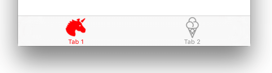
Now your Xamarin Forms iOS app wil look a lot more like an actual iOS app!
The code for this sample project can be found on GitHub right here. Enjoy!